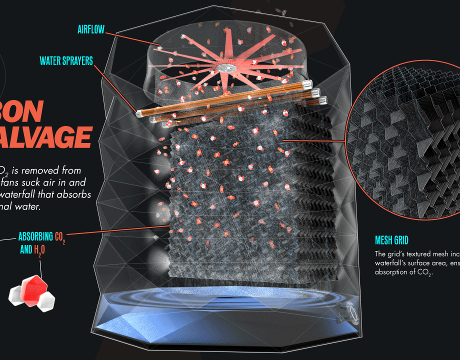
Prometheus Fuels
2020
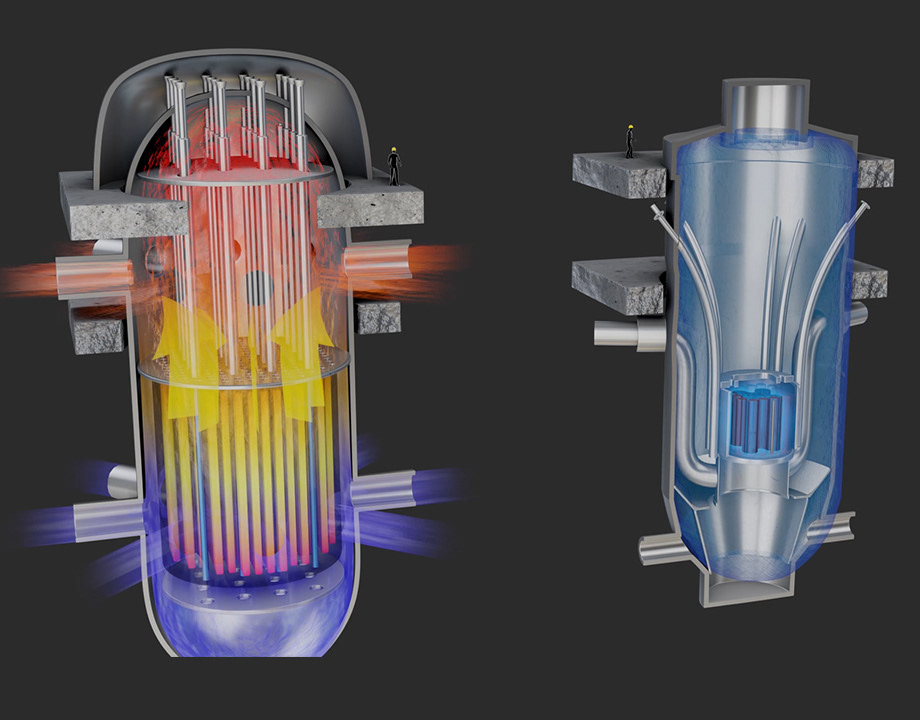
Idaho National Labs (part of the U.S. Dept. of Energy)
2020
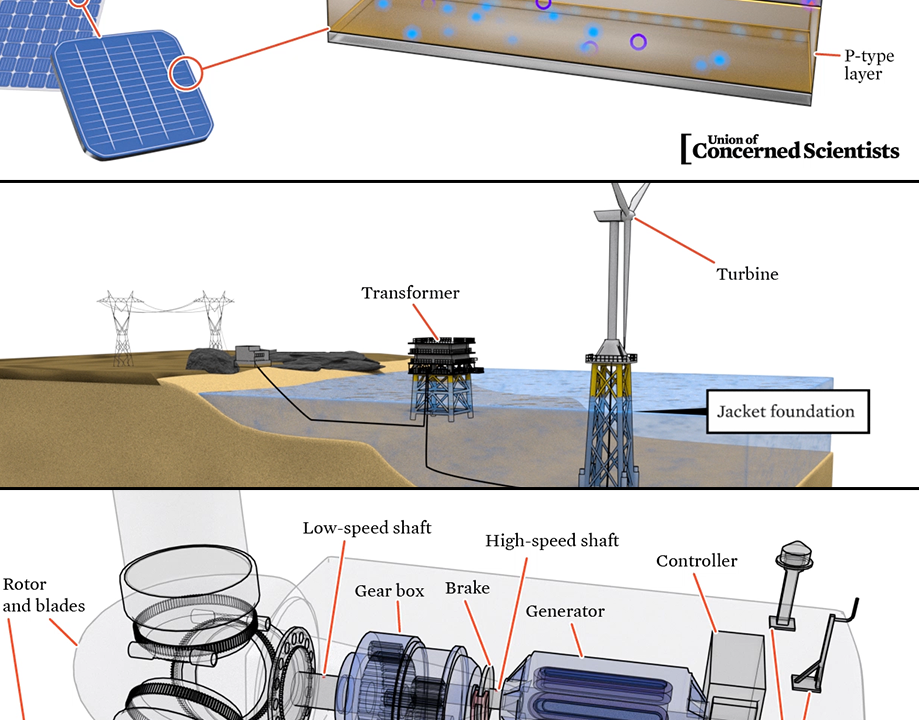
Union of Concerned Scientists
2019
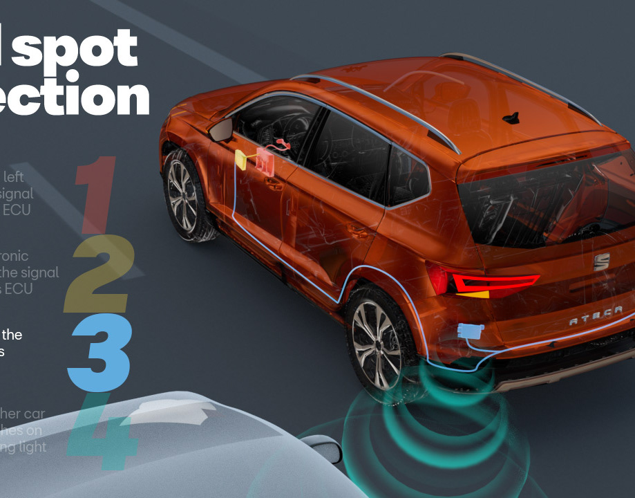
Blind Spot Detection - SEAT
2019
Video Infographics for News Orgs
2019
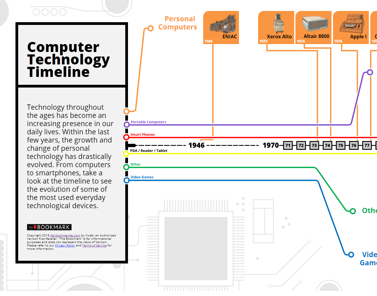
Interactive Infographic - Verizon
2018
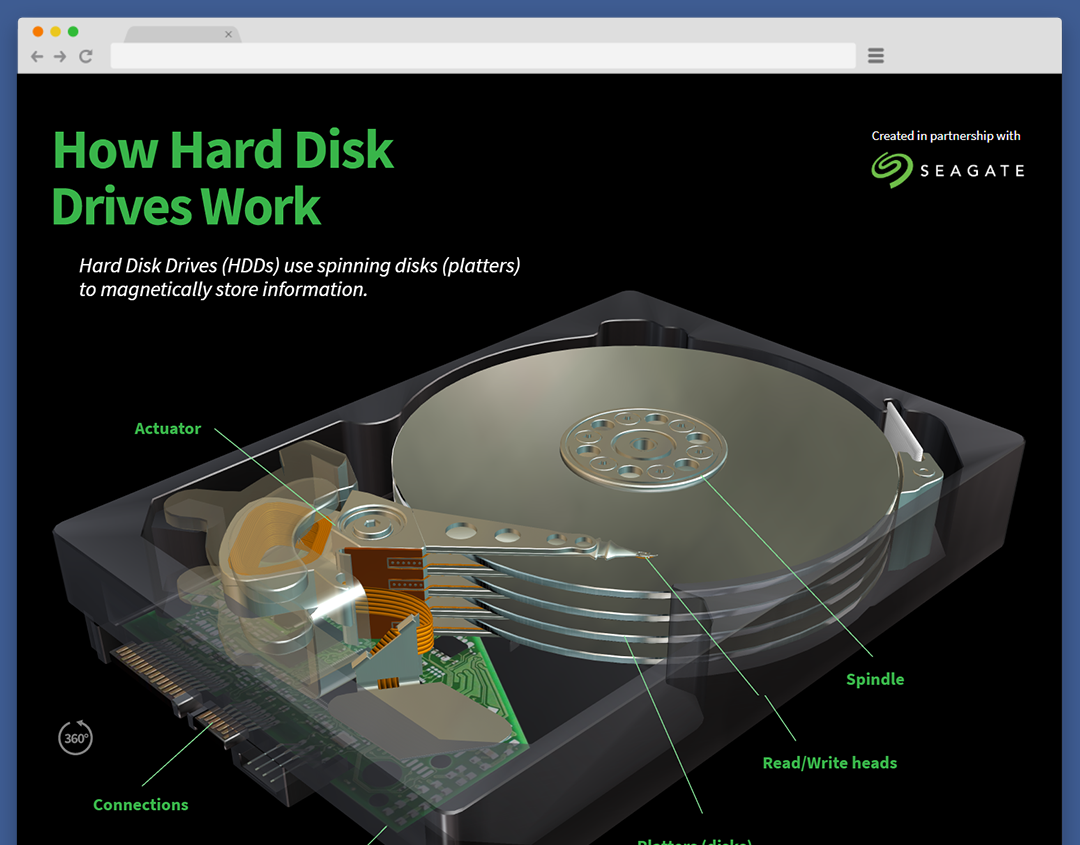
Seagate Hard Drives - Seagate
2018
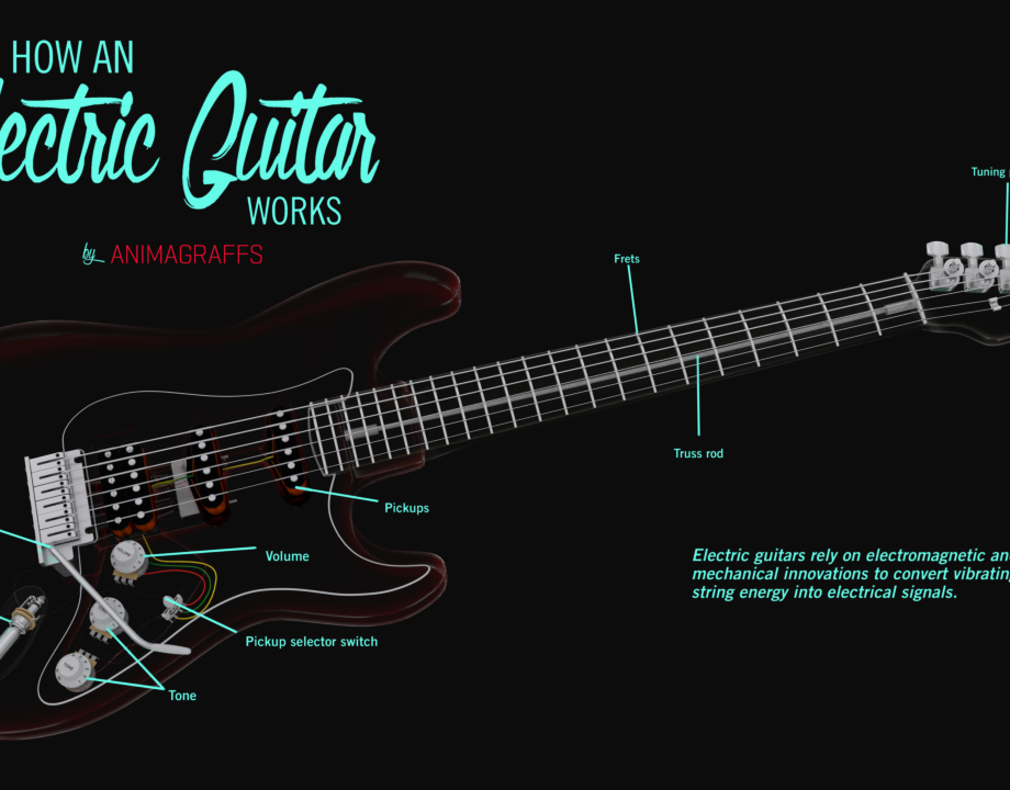
Electric Guitar - Animagraffs
2018
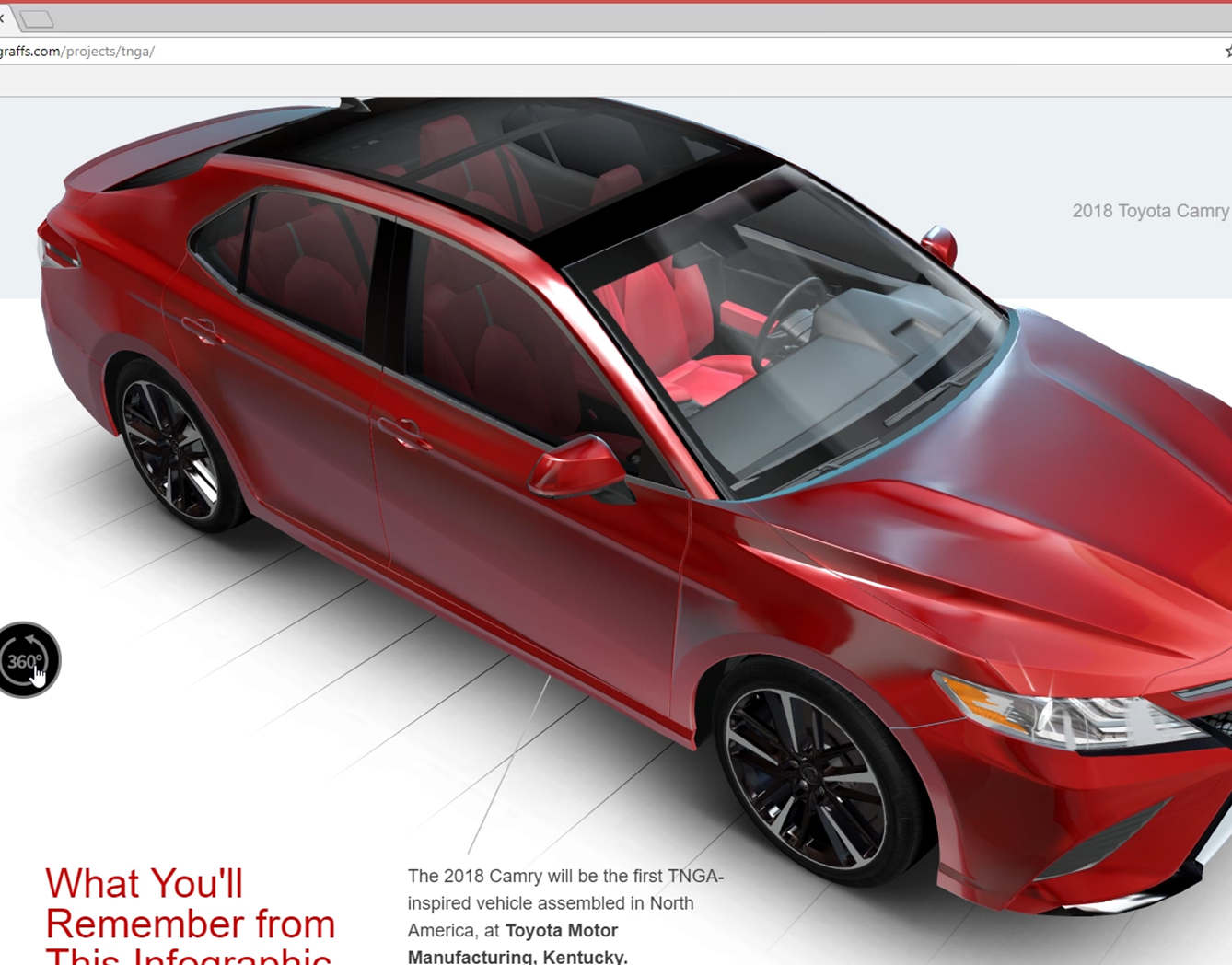
TNGA - Toyota
2017
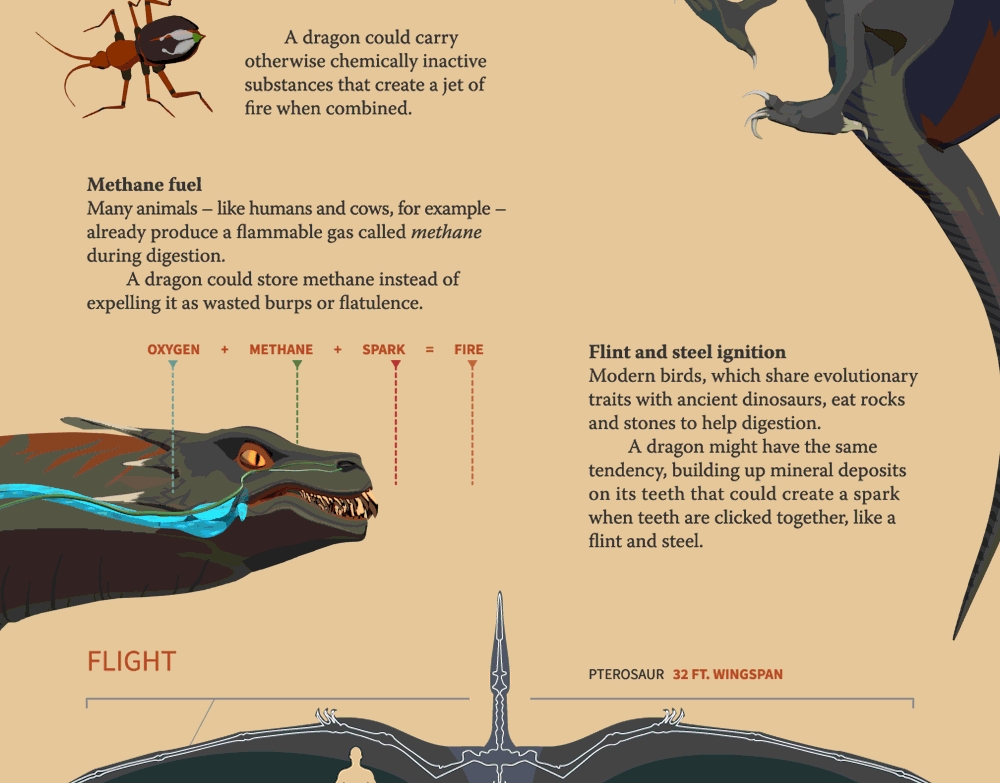
Could a Dragon Exist - Red Ventures
2016

Adventurous Jack - Personal
2015
GE Technology Showcase - Vayner Media
2015
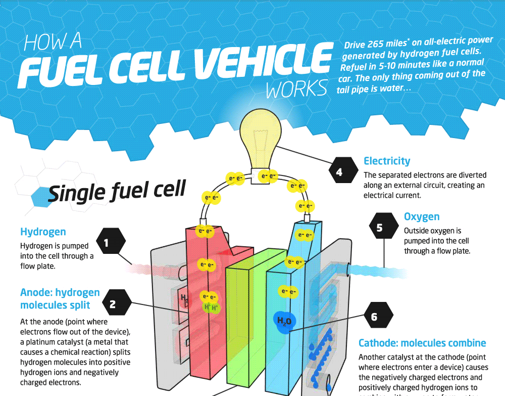
Fuel Cell Cars - Hyundai
2014

Silencer Infographic - Silencerco
2014
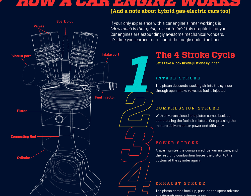
Car Engine - Animagraffs
2013
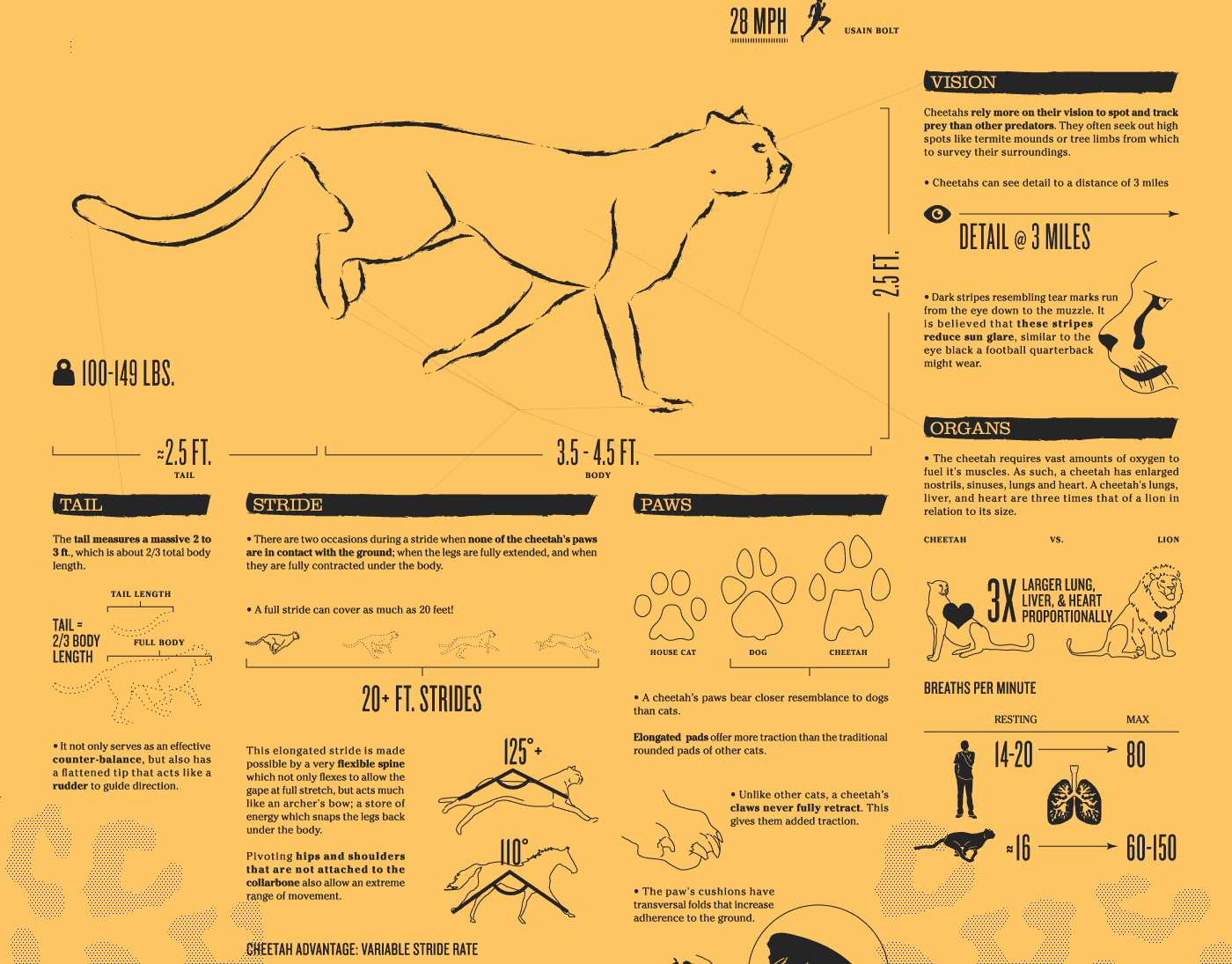
Cheetah - Animagraffs
2012